NOTE: After this was published, Bucknell reported an increase in cases and in an effort to tamp down any growth beyond whatever is already baked in, issued a shelter-in-place order for campus. The impact both on the university and on the larger community will be playing out over the next few weeks. As mentioned in the past, we must recall that the newly identified cases would have had several days prior to their discovery to infect others, if people were not being conscientious about their mitigation measures. Situations like this serve to highlight lapses and should prompt us all to be more consistent with masks, distancing, and staying home if we have had a known exposure or have symptoms.
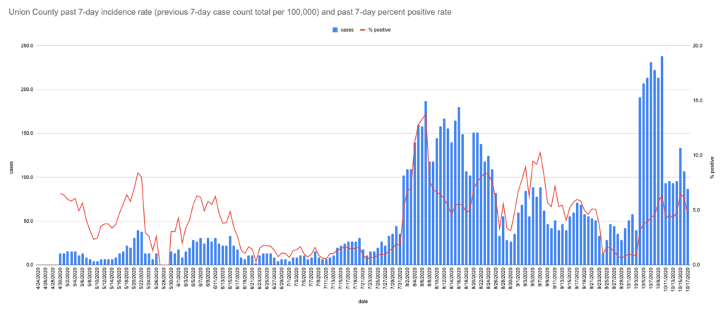
Looking at the Union County incidence rate and test positivity in mid-October, things look better than they did in August, but not as good as September. Since eSchool is not necessarily going swimmingly, there's a lot of pressure to just say whatever and send the kids in person. It's a tough call since no one knows for sure what will happen and what we really want to see is nothing happening… How does one make the call in the first place? We've got all these stats, but what do they mean?
If you keep an eye on info from the CDC and multiple different states, you will see the different ways they are handling the school reopening decision-making process. There are a range of responses. But even if you discard those promoting the "just open already" approach, there are different thresholds for settling on in-person, hybrid, and fully remote "learning models," depending on who you ask.
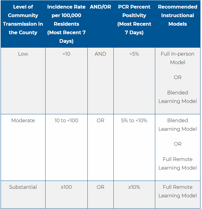
- PA has identified low, moderate, and substantial spread categories, corresponding to under 10 new cases per 100k per 7 days and/or under 5% test positivity, from 10 to 100 and/or up to 10%, and over 100 and/or 10%. And they have mapped different instructional models onto those levels of spread. The state Departments of Health and Education worked together to develop this rubrick (see table below), but districts do not appear to be following those guidelines, opting wherever vaguely plausible for in-person rather than hybrid. They are also punting in many cases on the issue of how to respond to cases in schools as they occur or reassessing school district decisions in light of the community context moving forward.
- In TX, a slightly different set of thresholds has been outlined, though covering the same general categories. UTHealth has a good dashboard for this. Their test positivity range is also below 5% (low), between 5 and 10% (moderate), or above 10% (high). The incidence rate range is below 10 per 100k per 7 days (low), between 10 and 25 (moderate), or over 25 (high). And they are a little more specific about the combination of factors that trip from one category to the other, rather than PA’s “and/or.”
- The CDC also seems to use similar categories, but are a bit unclear about what the corresponding "learning models" would be, leaving that to local assessment. They do clarify however that "The two measures of community burden should be used to assess the incidence and spread of SARS-CoV-2 in the surrounding community (e.g., county) and not in the schools themselves. Currently, CDC does not recommend using these core indicators as measures of burden within the school." Though that has been reported as happening in some school districts in other parts of PA. They talk about what the inherent risk in different set-ups would be rather than directly defining what would be the right choice at different levels of assessed community risk. They also break things into more shades of risk and more indicators to assess. Their incidence rates are number of cases per 100k per 14 days, but work out to similar cutoffs to the PA 7 day numbers.
- In GA, it's more like 50 new cases per 100k per 7 days (since they use 100 over 14 days) and anything below 10% positivity as ok to return to school. It should be noted that they appear to be pushing it.
So, looking at all those frameworks, the only thing that's clear is that if there are a whole lot of cases locally, the schools ought to be remote. The boundary conditions are a lot harder to determine. That's where recognizing that it's a privilege to be able to even attempt to do eSchool comes in. (If it isn’t too miserable for your kids and too impossible for your job.) And also acknowledging that by engaging that privilege, you might be making the in-person option just a little less perilous for those who have no other reasonable choice.
Add to that the importance above all of remembering that this continues to be a fluid situation. It is hard to say how we're doing locally even several weeks in, this (Oct 23) is Lewisburg's sixth full week. Other local districts that started a few weeks earlier seem to be developing more COVID cases, though not yet many in any one facility. In response, some have reverted to remote for a few days, sent a class home, or quarantined a few contacts. Some are continuing to operate.
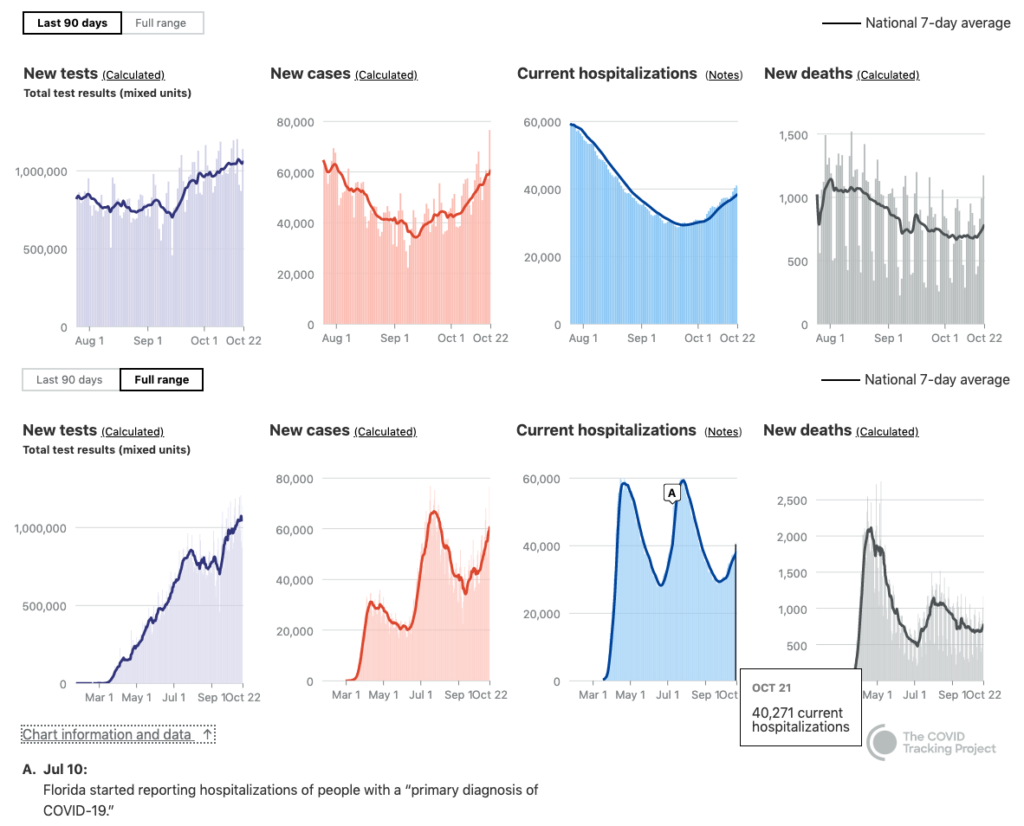
Statewide, these questions are raging. And schools are reporting more and more cases. Nationwide, too. Boston Public Schools just announced they would be going back to entirely remote as of today. In the same way that the CDC recommends against looking only at the cases within a school to assess the appropriate learning model, the long term outcome and consequences of keeping schools open are not expected to play out in the schools alone. Schools are part of a larger community.
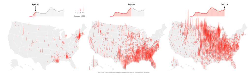
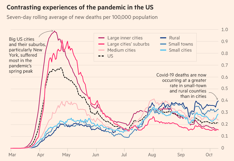
So how are they playing out in our community? Our local graphs fit into the larger current pattern of gradual, but widening transmission through rural areas. Though there is some talk of a "third peak," arguably rural America as a whole has merely had a single fairly gradual wave thus far. The multiple peaks are much more an artifact of summing the disparate experiences across the country than an accurate representation of any one state or locale. The big advantage for rural America is that, being so dispersed and compartmentalized, we COULD mitigate and not get drawn in to the rise, IF we take precautions. The jury is out on that of course.
Meanwhile, on the college front, Bucknell has managed to hold cases down (in spite of parties happening not per plan off campus), as is Susquehanna. Bloomsburg went fully remote for the remainder of the semester quite early on. And State College/Penn State has been a state hotspot with 7 day incidence rates of over 300 new cases/100k. It's now back down to incidence rates of "only 150" and that is with greatly expanded access to testing thanks to a mobile testing center set up by the DOH. Such centers have been set up in four different counties in the past month. Most schools are adapting their schedules to prevent more mixing of the population around the Thanksgiving holiday, with most curtailing on-campus activity after that and then not planning to bring students back to campus for the next semester until perhaps February (and planning to eliminate Spring Break and any associated temptation to travel).
We are all -- still -- just trying to make things work and the strategies that will get us through continue to be masks, distancing, and hygiene, as well as a commitment to stay home if we have had a known exposure or have symptoms on a personal level. At a societal level, we still need expanded testing, tracing, and treatment to be put in place by the powers that be. It continues to be a struggle and a slog, but hang in there. If you're doing your part, please know that it is both needed and appreciated!
It would be much easier to do all these things, keep things together, and figure out the nuances and finer points of transmission thresholds and optimal COVID-safe learning models, if we were all on the same page. Here's to moving in that direction!
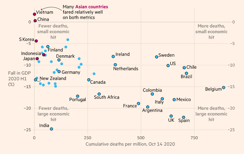
And (on the moving in the wrong direction front) for those holding up Sweden as the be-all-and-end-all of COVID responses, in spite of their high death rate and equally tattered economy, might I instead direct you to the more clearly salubrious and inspiring models of Vietnam, Taiwan, and Singapore? (Stay tuned for more on that in a forthcoming Radio Free Lewisburg episode with a special guest, Winfield native and current Swedish guest worker, Taylor Lightman.)
For further reading and review: There are multiple graphic renditions of the current spread of cases through rural America now also tracking with increasing hospitalizations and deaths. It is great to have this update after the one analytical map we had shared on the topic was a freeze frame/snapshot from the very beginning of August, featured in Question 3 of our COVID Q&A. The NYT article mentioned above covers it. As does this separate article looking only at rural areas, and leaving more populous areas off the map, and this brief animation by Brown University School of Public Health looks at it in yet another format. Compared to earlier in the pandemic, it's important to realize that while testing levels remain inadequate, they are, at the very same time, greatly expanded from where they were in March. In addition, there is better reporting of things like hospitalization and hospital capacity. So the first peak was likely much higher in terms of total cases whereas the current cases, while undoubtedly also an underestimate, are low by a much smaller factor.