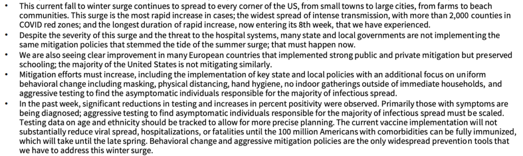
The current White House Coronavirus Task Force PA report (should be another one out today or tomorrow) points out that more than 2000 counties across the country are in COVID red zones with substantial transmission and a high risk of hospitals getting overwhelmed. To put that in perspective, there are only around 3,150 total counties, cities, parishes, and other jurisdictional entities that are not states in the entire country. So when they say "this current fall to winter surge continues to spread to every corner of the US, from small towns to large cities, from farms to beach communities," they mean that a full 2/3s of the country is dealing with out-of-control community transmission.
We have been compiling information about the progress of the pandemic here in our little corner of the Central Susquehanna Valley for most of this year. Please be warned that this is another one of our posts about "the numbers." We have definitely heard from plenty of people that these compilations are valuable, but we also have heard and want to recognize that breathless recitations of statistics and re-presentations of the numbers in a different format make a lot of people glaze over! If that's how you feel, this may not be the post for you.
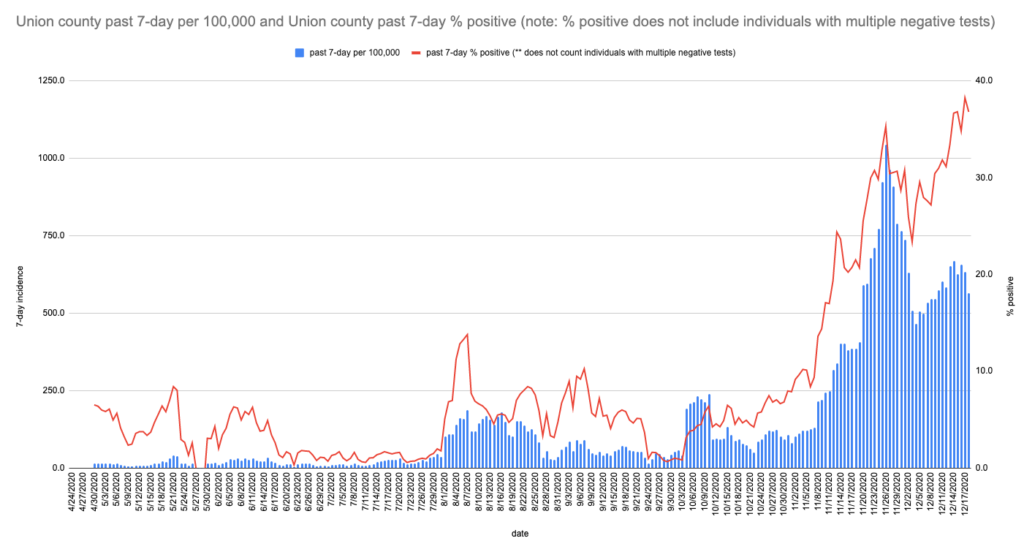
tl;dr: it's really bad pretty much everywhere. Our local bad situation kicked off in early November and at this point, asymptomatic spread is driving new cases at an ever faster rate. That said, it's even more imperative that we can/should/must mitigate and talk to others about doing so!
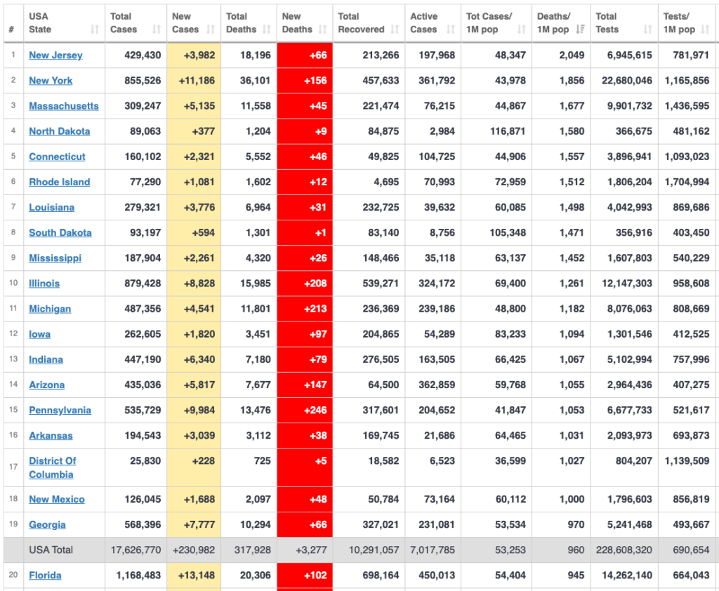
Over the weekend NJ had the dubious distinction of being the first state to cross the 2k dead/1M population mark. PA just crossed the 1k dead/1M, along with IA, IN, AZ, and DC. AR is at 999 as of this writing. We're also moving up in the rankings nationally, having recently moved past the national per capita dead mark; this indicates that we are on a worse trajectory relative to other states after several months of holding deaths lower. This is a horse race you really do not want to win... Everyone's number of deaths per capita is bound to increase, but they don't have to rise so quickly! With the vaccine being rolled out starting now, it's really a matter of just needing to hold on a few more months. We have had a lot of deaths during the past year might have been avoidable, but without a vaccine available it was hard to say for sure how long we could have deferred them, but now we're entering the period where any deaths really are avoidable in reality, if we can just hold out and not get sick before enough of us get vaccinated.
It goes without saying that the rest of the world is not in as dire straits. Last week there were stories about new outbreaks in Japan and South Korea in the news, but just to be clear Japan has one third the population we do and less than one hundredth of the COVID-19 deaths. Their per capita death rate is 22 as of 12/17. Not a typo. They reported about one hundredth of the new cases we did during that recent rise in cases...

All these numbers and stats make lots of people's eyes glaze over. Why do we keep bringing them up? Because we're convinced that there are more key numbers and relationships to figure out, that a simple daily list or table does not capture what's happening, and that putting these numbers in perspective is key both to bringing it home for some people and to understanding how unreal it continues to seem for others. For example, that two-thirds reference from the first paragraph helps to show the degree to which the carnage is now distributed across the entire country, threatening most of the counties/jurisdictions simultaneously. That is not really appreciated when the WHCTF report mentions there are over 2000 counties grappling with this; you need to know how many counties there are in total!
Once we do know that, we can think more clearly about the implications. It means that we have a lot more current leeway or capacity in our stressed healthcare system because we are pushing so many healthcare providers to their limit simultaneously. But it also means that when we do reach the breaking point, there is very little flexibility. We can't surge resources to any one part of the country when the entire country is already stretched thin. The strain is so uniformly spread out that we are able to endure a far higher level of demand but once we hit capacity then we will suddenly trip over into crisis.
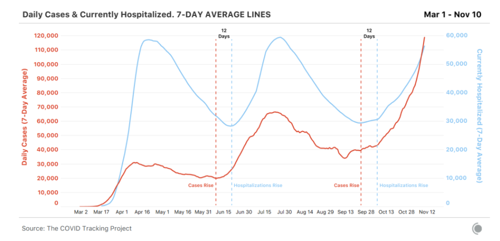
How does that play out "by the numbers"? During the spring peak, we counted around 2k COVID-19 dead/day nationally (though probably more as yet unassigned). We are now around 3k dead/day and while hospital capacity is threatened all over the country, it is not as overrun as it was in the NE and a few other locales in the spring.
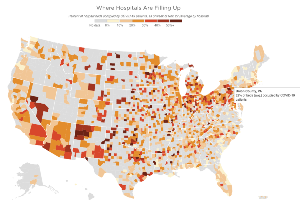
Back in March, ProPublica and the NYT were putting out calculators and analytical maps trying to gauge hospital capacity. This image is from a current assessment of stress on hospitals from the University of Minnesota, shared by NPR just this week. (The gray areas are places that do not have hospitals. It feels like their being grayed out does not adequately convey how vulnerable they are and how those blank expanses are adding to the noted stresses in the places with facilities. The graphic might work better with the gray areas in white and a contrasting background for the outline of the country; that might emphasize the isolation of the places that have beds to begin with.)
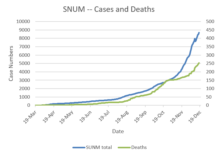
On a given day in a recent normal year, about 8k people die from all causes in the US. The total varies depending on the time of year, but that's the rough level. Contrary to some ill-sourced claims otherwise, the total number of deaths nationally for this year far outstrips other years. Narrowing the scope to PA, we normally lose a little under 400/day on average (that's somewhat more than our fair share on a per capita basis, because we are on average older and less healthy). And if you focus in on the valley (Union, Snyder, Northumberland, Montour), it's about 5/day. And for the county, about 1/day.
So let's think about what the spring overload looked like in NYC. There were about 1k dead/day in NYC at the peak. On a per capita basis, that number of deaths in central PA, in our little Union County, would come out to 5/day. If we have 5 people dying per day for a week or so that will be in some ways comparable to what NYC went through. That would be about five times our normal death rate, but still a fairly low number in the absolute. In fact it would be low enough that people will likely find themselves able to continue to dismiss it as not significant. For the valley as a whole, it would mean 20-25/day.
Another way of thinking about this is to look at the national stats for this past week, with upwards of 3k people dying on several days. That is just about 1 per jurisdiction (remember there are 3,147 of those). Around 15 total counties in the entire country did not have any reported cases in the past week. Precisely because the virus is so widespread, the number is really hard for people to focus on.
Meanwhile what do we think the daily numbers will rise to? Hard to say, though it's pretty much guaranteed that nationally we will be at 4k/day by Xmas. We could start driving those numbers back down by New Years if we really step up our mitigation right this instant. If we want to pull that off though, we need to start doing it today.
Right now IA, ND, and SD are thrilled to have their case numbers and hospitalizations on the decline. Their recent case surges peaked starting around Thanksgiving. Of course they are still registering very high death counts because the deaths lag cases by around 3 weeks or even more. That's the pattern we've seen over and over. Eventually, deaths will drop to lower levels again, too, provided they don't kick their case counts back up again. The drop in cases is what we are trying to accomplish now here.
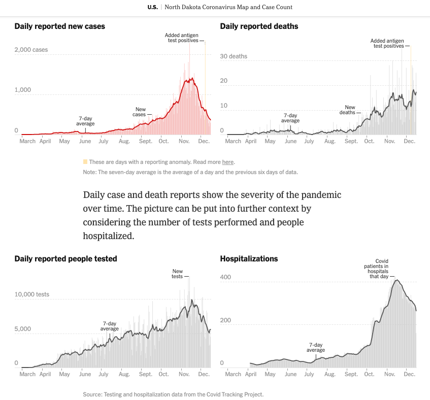
Cases and deaths are still rising here. People are inclined to connect the current number of cases reported in a location to the deaths that are reported the same day, but here we are in mid-December and these mid-December deaths are from cases that were first reported just before Thanksgiving. You could think of them as November's deaths. Then look at those graphs and tables and note that we have doubled our total number of cases reported since Thanksgiving. The deaths associated with the early December cases will start to hit this coming week.
This is all of course on average. Some case timelines are much more compressed, but in general, for the cases having a rough time of it, it's about 10-14 days from detectable infection to hospitalization and another 10-14 days from hospitalization to death.
Seeing how the upper midwest may be turning a corner and they barely have anything in place in the way of mask mandates in place, does that just mean that cases will just automatically fall after rising for a while? No. Transmission doesn't really care whether there's a policy or not, it just responds to action. If policies help increase mitigation, cases will eventually start to drop. If there are no policies but individuals start to recognize the problem and finally start to mitigate, cases will eventually drop. The drop is indexed to action. And if there are policies, but people refuse to follow them, cases will not start to drop.
And clearly the drop doesn't happen right away. Cases started to level off in the Dakotas by around November 7 and drop by Thanksgiving because more people started increasing their mitigation efforts there around the end of October. They are still waiting for the deaths to drop, more than a month after they started reducing exposure. It takes effort. It takes discipline. It takes time. It takes knowledge. Luckily we know what to do now.
What actions do we need to take? We know the drill:
- It starts with masks, distancing, and hygiene.
- It extends to isolating if you've had a positive test, a known exposure, or have any symptoms (really, symptoms of any kind).
- And as we've been talking about since the end of summer, it also means avoiding indoor gatherings with people from other households. It doesn't feel normal for gathering with loved ones to be dangerous, but if they live in other households, right now it likely is!
- There are also the next natural steps like downloading and using the COVID Alert PA app and making a point of answering the phone if a contact tracer with the PA Department of Health calls, but those really are the basics.
- The advanced version is to really get well-versed in the reasons for all these actions, understanding the frequency of asymptomatic cases and therefore of asymptomatic and pre-symptomatic spread -- which are why masks, distancing, and isolation are so important -- or following the stats for test positivity and incidence rate in the community, or familiarizing yourself with the protocols for and nuances of testing and quarantine (especially to understand the limits of what a test can tell you).
Ultimately though, what all this boils down to is that it's entirely up to us. It's up to us to put these risk reduction strategies into action in our own lives. And it's up to us to help make sure more people in our community understand what they need to be doing (bonus points for understanding why). How many people can we each reach out to with some personal encouragement and recommendations to reduce infection risk? How many times can we successfully make the case for kindness and compassion and a little more caution in our community?
Do you have any local contacts that might not have been paying as much attention to all this up until now that you can reach out to? That's who we need to be talking to now.
If you have any questions about information or scenarios or advice either on your own part or that you're hearing from others, feel free to pass them on. We can probably come up with a reference or a resource or find someone who knows the answer and we can maybe work to hold those awful numerical abstractions and their wrenching concrete realities down by a few...