Let me preface this by saying, this article is NOT intended to incite panic, but rather to ensure greater understanding and encourage a rational local response. Let's look at where we stand here in early November.
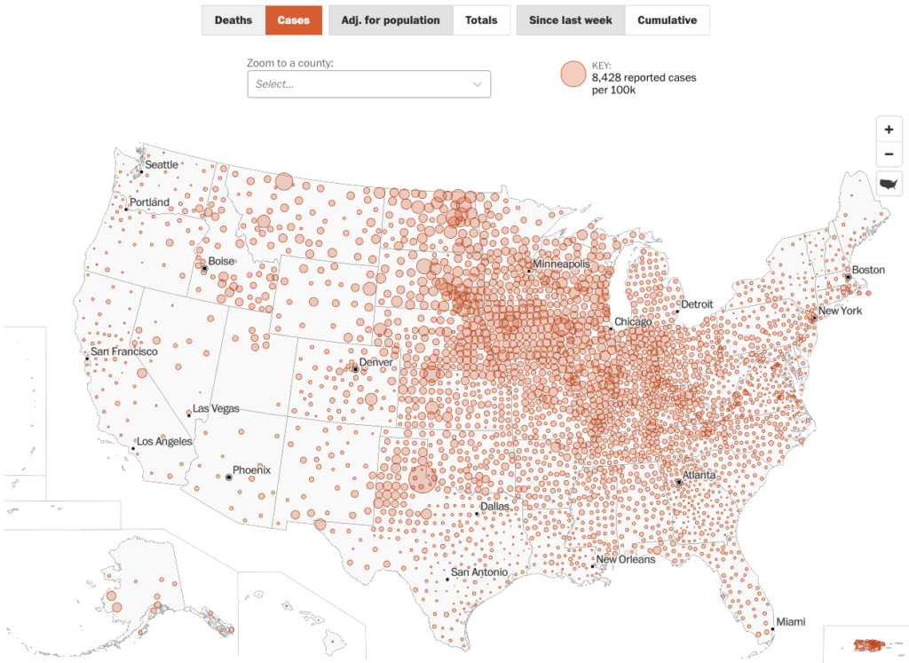
In case you haven’t noticed, COVID-19 is spreading widely in most of the country. Geisinger Health System's CEO noted in the Daily Item last week that they are seeing a COVID patient every 2 hours at this point in our central PA region. In the Central Susquehanna Valley, this seems to reflect a shift beyond cases in long term care and prison facilities; it is out in the general public here now.
Contrary to popular refrains, the virus is not disappearing.
That said, it’s not hard to understand how people might be getting that impression. Some are explicitly arguing that we should ignore the virus (though not with much convincing evidence to back the idea up). And even for those not toeing that line, many are coming away with a similar impression because of how the pandemic is presented in the news. People are not being given enough information in a clear enough way to understand what the situation is.
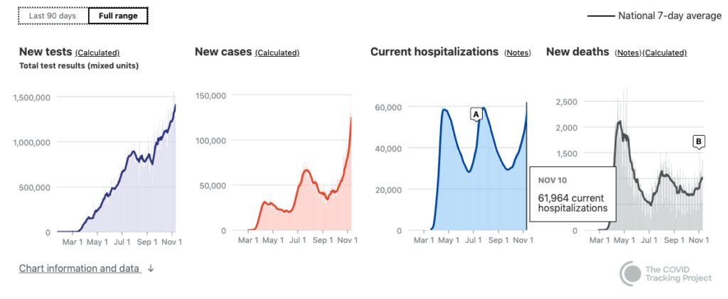
News articles keep breathlessly pointing out that cases have reached new heights, without 1) clarifying that they mean confirmed cases, 2) reminding people that early on, we were undercounting cases by a great deal, or 3) pointing out that hospitalizations and deaths lag behind case diagnosis by anywhere from one to six weeks. So, we are seeing a significant rise in confirmed cases, but its scale with respect to the spring is unclear and the associated deaths have not yet hit. On the one hand, there is understandably wishful thinking that the deaths just won't ever come. There is a hope that treatments have improved and the death rate isn’t really that bad and therefore we just won’t have as much of a problem as other places did in the spring.
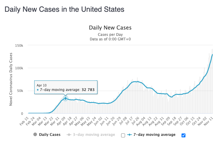
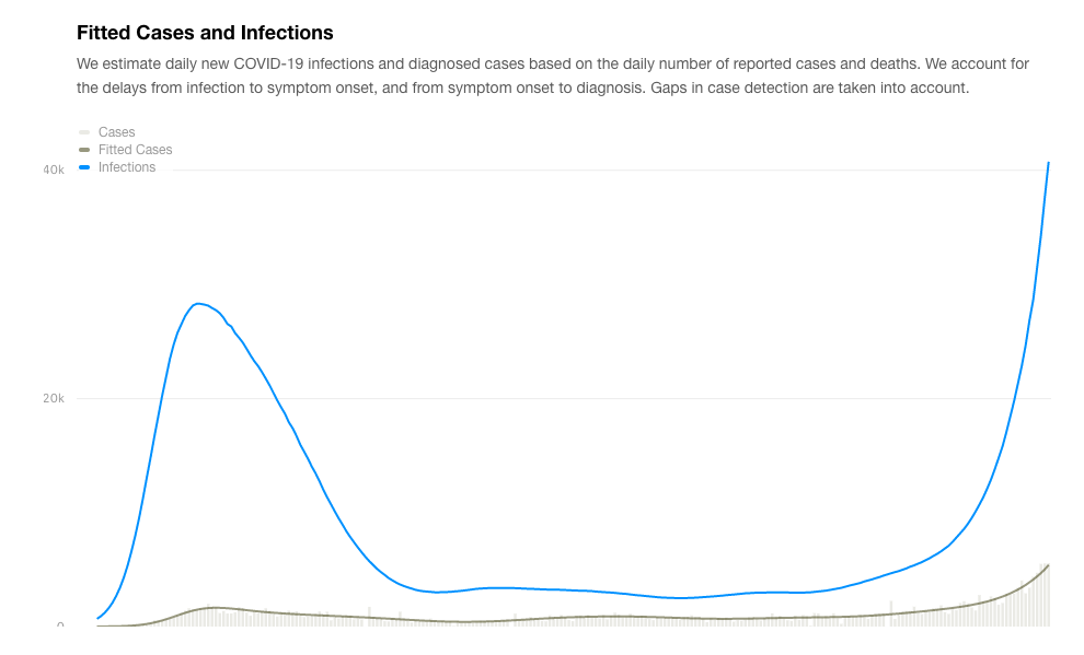
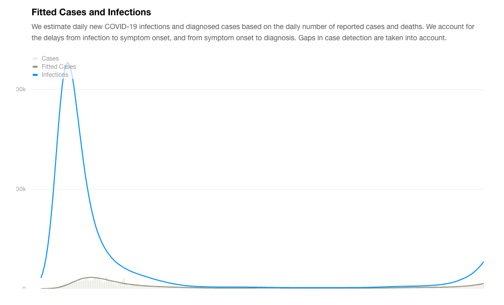
This misguided hope is at least in part a function of bad journalism. There’s so much uncertainty at this point, even looking back six months that no one wants to draw the graph that would illustrate the scale of the undercount of cases in the spring. Lack of testing availability and awareness that the virus was present could well mean that that curve of new daily cases reached up to 100k-200k (plus or minus a lot clearly) back in April. Put in perspective with that, our current levels do not in fact dwarf the spring surge, though they are probably now starting to match it.
We can say that the increase in cases is probably rising somewhat slower than it did in the spring because we do have some mitigation in place, but these cases, as we are all aware, are spread out all over the country and most of them are in places where people honestly do not think it will be a problem (including here). That conviction and consequent lax behavior with respect to public health measures undercuts the benefit we might enjoy from mitigation compared to the spring.
I discussed some of this on WKOK’s Sunrise Show on November 5 -- in particular the false confidence being unintentionally cultivated by bad reporting that leads people to conclude the current rise in case numbers doesn’t really warrant any concern.
For a reference on how many more cases there actually were in the spring, see this article and links in it. It is from a few months ago, but the general concept has held up. The undercounting factors noted in the title do not mean that the national numbers would necessarily get multiplied by 10 early on, but rather that significant undercounting should be taken into account now when looking back at that data. For example, working off of serology results available for NY, it is likely that that state has had more on the order of 2M cases to date (rather than the under 600k confirmed cases listed right now).
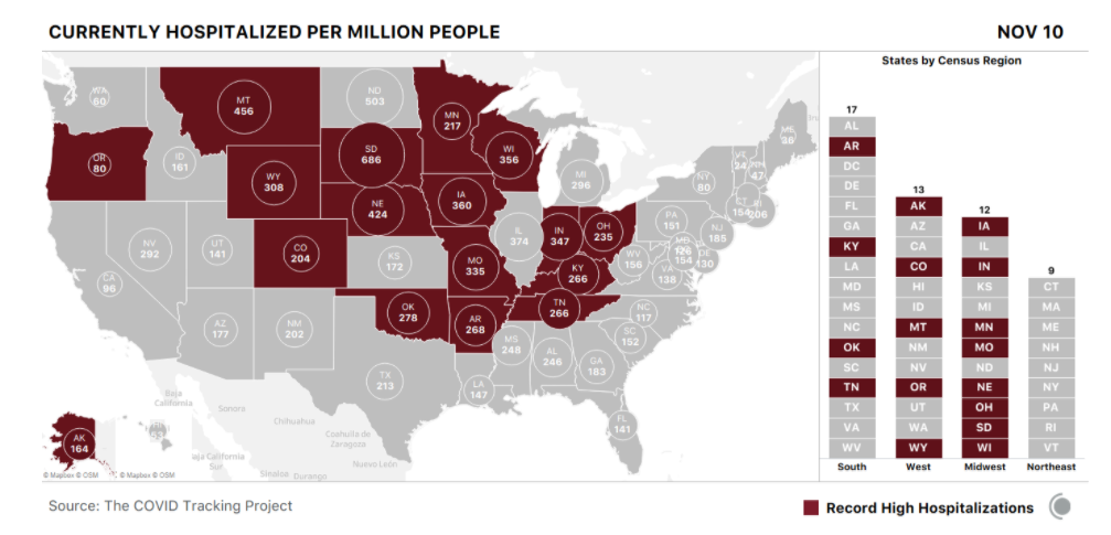
So if looking at the case numbers is so problematic, what other options do we have to understand the progress of the pandemic? We can look at hospitalizations and (eventually) deaths. There are 17 states hitting record levels of hospitalizations now.
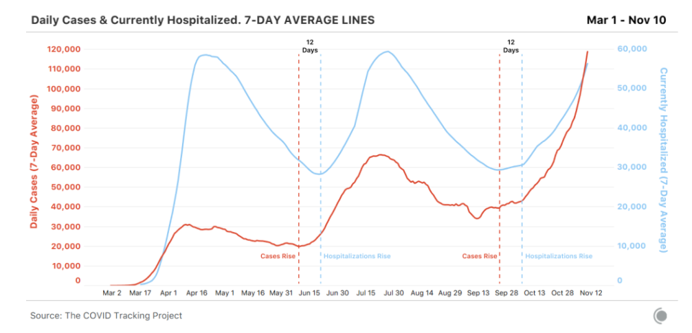
That begs the question in turn of how hospitalizations compare over time, when we set current numbers against the spring numbers? We can expect/hope the hospitalization numbers to go higher with a subsequent wave of deaths that winds up being proportionally lower than that from the spring. There will still be a following wave of deaths, but it will likely be lower in relation to the number of hospitalizations because 1) more younger people are included in the case counts right now than were early on, 2) more people are going to the hospital (as compared to hunkering down at home and just toughing it out in NYC in April), and 3) we do have more knowledge about how to fight the disease. All of this is hopefully dropping our Infection Fatality Rate closer to around 1.5% from the high Case Fatality Rate from the spring upwards of 6% or even 10%. Again, some news coverage is not helping with public understanding here, especially those that keep promising that these rates are falling without clarifying that they are falling from the extreme heights of around 10% not dropping below what looks to be the actual IFR of around 1.5% (which it must be emphasized is still substantially worse than the flu by about an order of magnitude).
(Also from the above article.)
Of course, at the same time that there are factors driving the death rates down, there are others that will push the trend in the other direction. It remains to be seen how the dispersed, limited, and underresourced rural healthcare system around the country copes with the COVID-19 overload in comparison to spring in super urban locations. Indications are that the rural advantage of low population which translates into built-in distancing has been largely frittered away by people rejecting public health guidelines and that the healthcare system, while valiant, may well not be up to the task.
So, to sum up, spring hospitalization figures are likely also an underestimate of the actual demand at that time because all capacity was in use in very few jurisdictions. People who would otherwise (or now) have been hospitalized never got there, got sent home, or did without entirely. So the good news is the fact that we have exceeded the hospitalization levels from the spring (nationally) is bad but not yet catastrophic. The bad news is there’s not as much wiggle room between bad and catastrophic as there is in the confirmed case count.
And what do our current numbers look like locally? Glad you asked! Current graphs show us to be matching our highest levels of both cases and test positivity from earlier in the year, with the notable differences this time being that both measures are high at once and the cases we're seeing are largely in the general population rather than connected to prison sites. There are also a number at Bucknell, but that does not mean they are isolated from the rest of us.
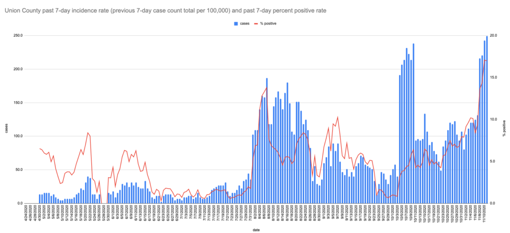
Lest you take my cautions about how the graphs over the course of the year tend to seriously undercount case peaks back in the spring too much to heart in this context, please understand that that doesn't particularly apply for the parts of the country that didn't _have_ spring peaks, like here. Union County's current highs likely are actual highs even while the PA stats statewide are probably only about halfway to the level of the spring peaks.
The upshot: keep it up with all the masks, distancing, hygiene, and symptom/exposure watching, download the PA COVID Alert App, and start getting creative about your holiday isolation plans (another post on that is in the works). Plus root for the vaccine and the coordinated national response getting kicked off now. Maybe invest in some heated insoles or other outerwear.
To borrow Dear Pandemic’s tagline, “stay safe, stay sane.” (And enjoy a little multi-lingual wordplay given that “sano” is Spanish for “healthy.”)
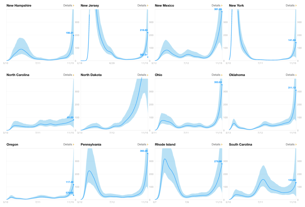
EDIT to add: This COVID Estimator website offers estimates of actual infections (both raw and per 100k), Rt value, and the estimated seroprevalence, providing ranges for each and background detail both by state and by county. This clarifies the discussion above about the relative situation of the curves in different states in relation to their earlier outbreak experiences. You'll note that some of the states are "off the charts" on the home page graphs show above. For reference the estimated infections for both PA and NY are shown here.